

Road-Tech rebranding
Role: Designer
Our client Salado Sales ( a subdivision of McLane) approached us to rebrand it's automotive line of products. Below is an image of the original packaging of one product. Aside from the logotype and the image of the road, very little tied each of the product lines together. They were cluttered, difficult to read and often created with various typefaces used throughout.
These products were mainly sold in convenience stores. Often times as a more budget-friendly alternative to any bigger brands. Our goal was to twofold. We wanted to help the product stand out on those shelves and at the same time create a look that was more in-line with the major brands.

Competitive research
The research I did on the competition revealed a lot of labels with large logos and huge blocks of type outlined in black. All of this combined with very little attention to hierarchy and a need to mention every benefit the product provides makes for a messy presentation on the shelves.

Exploration
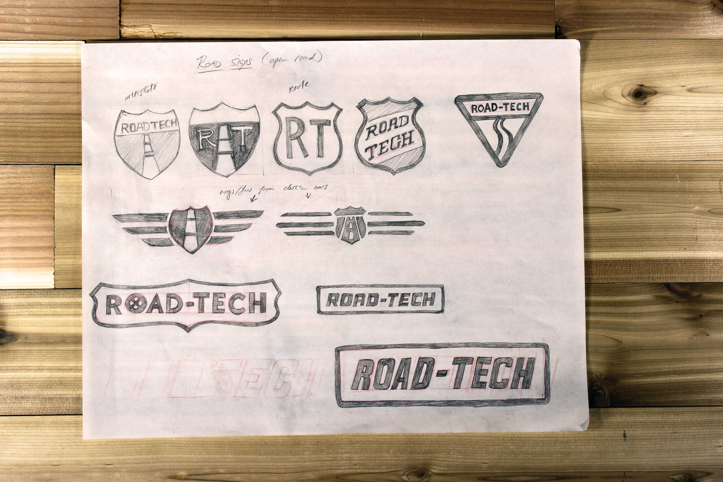
This was the direction I proposed. The logo became a combination of a clean typeface, a skewed silhouette of a road sign, and a some stripes that called back to the excitement and freedom that came from the era of classic cars. The simplified design and clear hierarchy gave it a cleaner look that would have made it stand out on the shelves.


This was the direction I proposed. The logo became a combination of a clean typeface, a skewed silhouette of a road sign, and a some stripes that called back to the excitement and freedom that came from the era of classic cars. The simplified design and clear hierarchy gave it a cleaner look that would have made it stand out on the shelves.


