

Texas School for the
Deaf Foundation logo
Role: Designer
After working with TSDF for a few years, they decided to change their focus a bit and work on their own identity. We were asked to create a new logo for them to help differentiate themselves from the school they support. The logo they had been using was just a modification of the school logo which made telling the two apart very difficult.
We were challenged with trying to show a combination of things for the client. They really liked the star in the original logo and the color. We had also learned over time that their community and support for the school were very important parts of who they were.
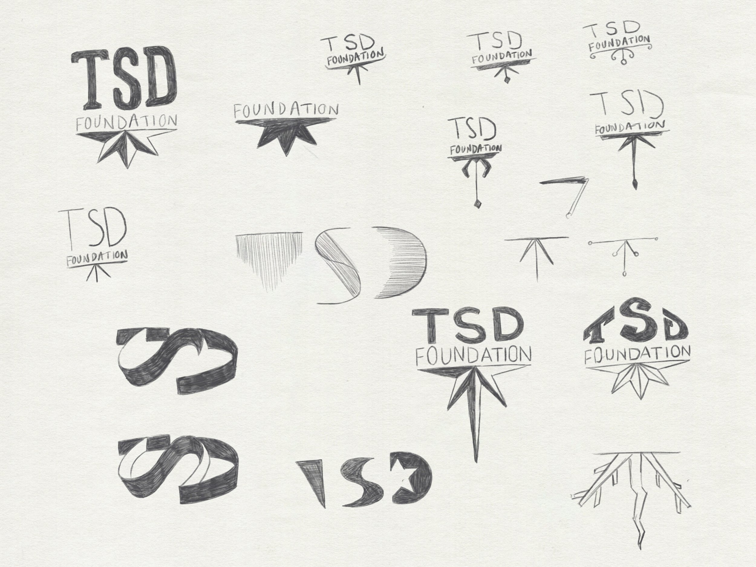
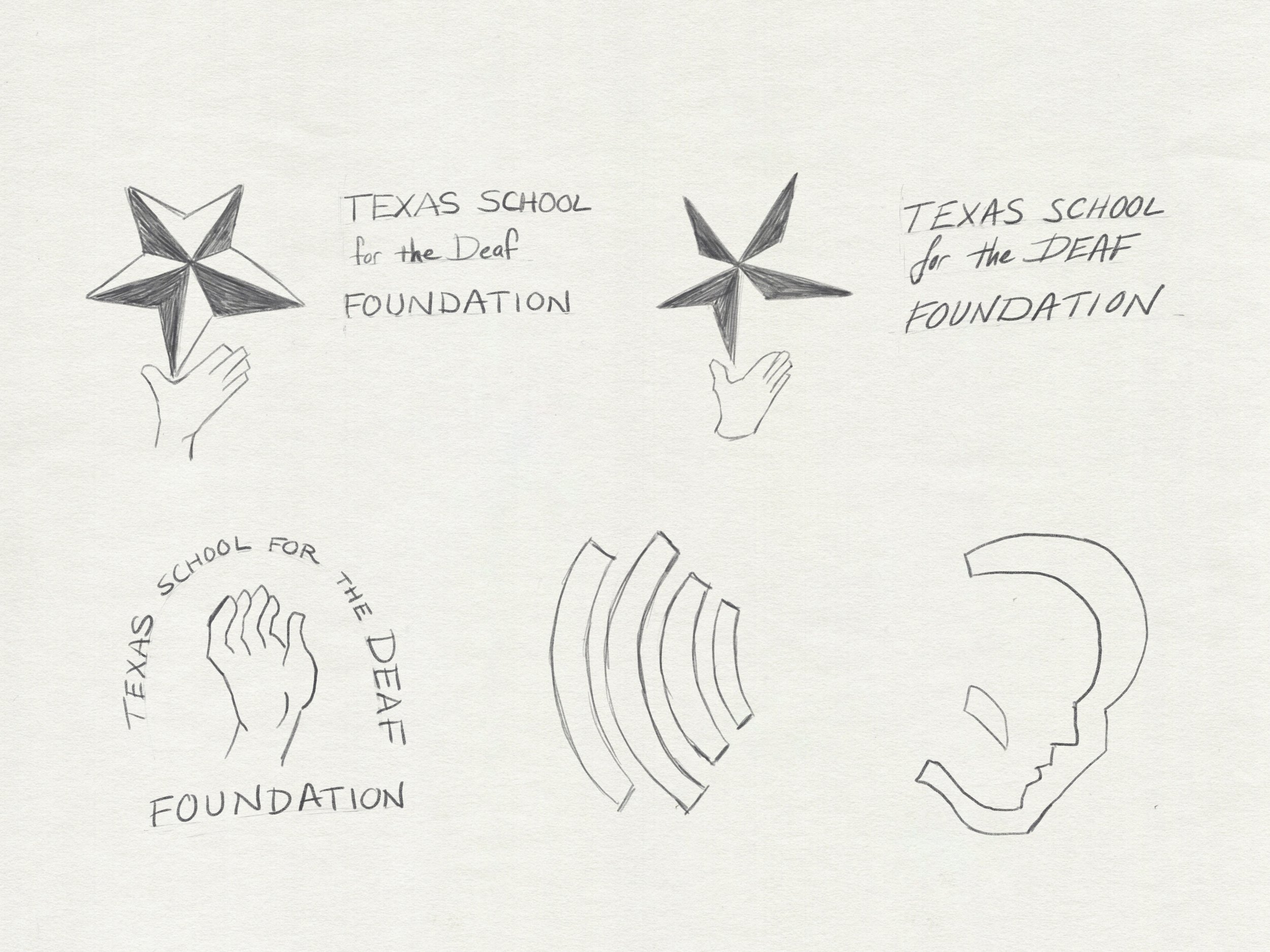
Exploration
The sketches below show some explorations. Some incorporate a hand to show support and allude to sign language. Some were attempts to use the same star that was in the original logo. And others were explorations in using their initials as the focal point.


In the end, I thought the logo I came up with solved all of those needs and wants. The four skewed rectangles come together to represent a cornerstone which shows the Foundation's support of the school. I was able to use the negative space created by them not meeting in the middle to create a star. However, instead of including a star for the sake of showing a star, I gave it purpose. It's reminiscent of a star you might see in navigation. This was meant to reflect the Foundation's role in determining where the money raised would be used in the school.
